Yesterday, the ever-popular Jeff Atwood (of Coding Horror fame) wrote an article [*] on how not to write Web 2.0 UIs. Unfortunately, it’s exactly backwards: What he identifies as a problem is in fact not only desirable, but necessary.
- [*] Aside: Jeff, I know you love pictures, but is that particular gratuitous one really necessary? Yes, I know it’s CGI, but it made me really hesitate about linking to your post and has nothing to do with your technical point.
Jeff observes correctly that when you write an application to run on a platform like Windows and/or OS X, your application should follow the local look-and-feel. Fine so far. But he then repeats a claim that I believe is incorrect, at least today, and based on a fallacy — and adds another fallacy:
[Quoting Bill Higgins]
- … a Windows application should look and feel like a Windows application, a Mac application should look and feel like a Mac application, and a web application should look and feel like a web application.
Bill extends this to web applications: a web app that apes the conventions of a desktop application is attempting to cross the uncanny valley of user interface design. This is a bad idea for all the same reasons; the tiny flaws and imperfections of the simulation will be grossly magnified for users.
…
- When you build a “desktop in the web browser”-style application, you’re violating users’ unwritten expectations of how a web application should look and behave.
There are actually two fallacies here.
Fallacy #1: “Look and feel like a web application”
The first fallacy is here:
a web application should look and feel like a web application.
…
violating users’ unwritten expectations of how a web application should look and behave.
These assertions beg the question: What does a web application “look and feel like,” and what do users expect? Also, are you talking about Web 1.0, where there is an answer to these questions, or Web 2.0, where there isn’t?
For Web 1.0 applications, the answer is fairly easy: They look like hyperlinked documents built on technologies like HTML and CSS. That’s what people expect, and get.
But the examples Bill uses aren’t Web 1.0 applications, they’re Web 2.0 applications. For Web 2.0 applications, there are no widely accepted UI standards, and applications are all over the map. Indeed, the whole point of Ajax-y/Web2.0-y applications is to get beyond the current 1.0-standard functionality.
Not only are there are no widely-accepted UI standards, there aren’t even many widely-accepted UI technologies. Consider how many dissimilarities there are among just Flash, Silverlight, and JavaFX as these technologies compete for developer share. Then consider that even within any one of these technologies people actually build wildly diverse interfaces.
Here’s the main example these bloggers used:
Consider the Zimbra web-based email that Bill refers to.

It’s pretty obvious that their inspiration was Microsoft Outlook, a desktop application.

But what’s wrong with Zimbra?
Here’s a Better Question #1: How could you do better?
And for bonus points, Still Better Question #2: What about OWA? Consider that Microsoft already provides essentially the same thing, with the same approach, in the form of Outlook Web Access, which looks remarkably like the usual Outlook [caveat: this is an example of why I write above and below that ‘most’ Web 2.0 apps don’t try to emulate a particular OS look-and-feel; this one does]. For example (a couple of sample shots taken from this brief video overview):
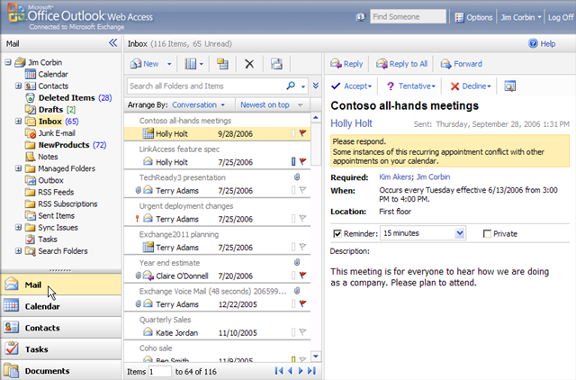
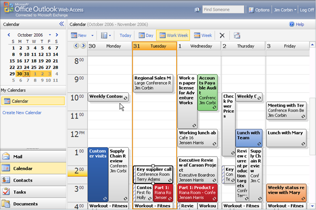
The rich UI isn’t a bug, it really is a feature — a killer feature we’re going to be seeing more of, not less of, because this is what delivering software-as-a-service (SaaS) is all about. Although I use the desktop Outlook most of the time, I like OWA and think it’s the best web-based email and calendaring I’ve seen especially when I’m away from my machine (and I’ve tried several others, though granted you do need to be using Exchange). I suspect its UI conventions are probably pretty accessible even to non-Windows users, though that’s probably debatable and your mileage may vary.
Fallacy #2: “A web app that apes the conventions of a desktop application is “
The second fallacy is Jeff’s comment (boldface original):
a web app that apes the conventions of a desktop application is attempting to cross the uncanny valley of user interface design.
I think this is flawed for three reasons.
First, the “uncanny valley” part makes the assumption that people will find it jarring that the app tries to look like a desktop application. (This concern is related to, but different from, the concern of fallacy #1.) But most such apps aren’t doing that at all, because they know their users will access them from PCs, Macs, and lots of different environments, and they have to look reasonable regardless of the user’s native environment. They’re usually not trying to duplicate a given platform’s native look and feel.
Second, what they are doing is borrowing from UI components and conventions that already work well in desktop GUI environments, and are common across many of those environments. When you have no standards for Web 2.0 look and feel, then doing the best you can by borrowing from ideas we already know work pretty well isn’t just okay, it’s necessary. What else can you do?
Finally, the worst part is this: The whole point of SaaS is to deliver desktop-like rich-GUI applications on the web. So what is being labeled ‘wrong’ above is the whole point of what we’re doing as an industry.
“SaaS/Web 2.0 on Web 1.0”: The new “GUI on DOS”
Most SaaS/Web 2.0 applications today look and feel pretty much the way GUI applications looked and felt like on DOS, before technologies like Windows and OS/2 PM existed. Around the late 1980s, people wrote lots of GUI applications that ran on DOS, but we didn’t have a widely-used common GUI infrastructure that handled basic windows and menus and events, much less standards like CUA that tried to say how to use such a common infrastructure if we had it. So they each did their own thing, borrowing where possible from what seemed to work well for GUIs on other platforms.
Twenty years ago, everyone writing GUIs on DOS designed the UIs as best they could, borrowing where possible from what they saw worked on platforms like the Macintosh and Xerox Alto and Star — but the results were all over the map, and would stay that way until a standard environment, followed by standard guidelines, came into being.
Today, everyone writing rich Web 2.0 applications is doing their own thing, borrowing as best they can from Macs and Windows and others — but the results are all over the map, and will continue to be until there actually is such a thing as a UI standard for rich-GUI web applications. You can see that in the differences between Zimbra and Outlook Web Access. In the meantime, it’s not just okay to borrow from what we’ve learned on the desktop; it’s necessary.
And the question isn’t whether metaphors users already understand on the desktop will migrate to the web, but which ones and how soon, because it’s the whole point of SaaS. The industry will soon be going well beyond Google Apps; with offerings like Office Online already announced for the short term, which puts still more rich-client GUI apps like word processors and spreadsheets in the browser (with functionality somewhere between Google Apps and the desktop version of Office).
Zimbra and Outlook Web Access aren’t examples of poor web app design, but exactly the opposite: They’re just the beginning of the next wave of rich web apps.

To simplify,
If you’re developing a user interface, either give people exactly what they’re used to, so they won’t have to ask questions, or give them something a world better than what they’re used to, so they’ll want to learn more.
A different way perhaps to look at this is to differentiate between good UIs and bad UIs. Coming up with good user interfaces on web or desktop requires creative thinking and placing yourself as the end user.
Lets consider the example you listed — the mail client. There are 4 products which I have used personally :
1. Gmail
2. Yahoo mail (new version)
3. OWA (IE version)
4. OWA Light (Firefox)
Perhaps of all of the above, Gmail gets it right, because they just understood what the end user would like to have – conversation view, great spam filtering, auto contact fill, search and many other features which make it simple, intuitive and a pleasure to use. If there was a desktop client to be developed for Gmail, i would go for exactly the same UI design followed on the web. It just works.
Now look at what Yahoo did when they came with their web mail client (new version). Although its a good attempt, it never really attracted the end user, because of its heavy handed style. They tried to mimic the outlook client but IMO failed because the web app was not responsive enough. None of the UI features really made it stand apart or make the end user’s life easier.
The latest OWA on IE which tries to create Outlook on the browser on the other hand succeeds. Infact i like its responsiveness better than the desktop client itself. Till now they have tried to keep features simple and fast which is the key.
The idea for a good UI is to be simple, intuitive and fast. To be fast is to be more responsive as an application with less number of clicks required. The apps which will get this will do well, the ones which will not will have to evolve.
In this context Jeff’s argument really does not stand. There is no “uncanny valley” here. There are only good and bad user interfaces.
Martin wrote:
Right, but a key point here is that when you borrow from the desktop metaphors, a lot of people are liable to think you’re trying to imitate desktop apps even though you aren’t. Remember that the specific app he used as a case in point as ‘trying to copy Outlook’ actually wasn’t trying to copy Outlook at all, as noted by one of that app’s developers I quoted in my last comment.
David wrote:
Bingo. Plus of course Web 2.0 apps will continue to draw from metaphors Web 1.0 apps are already good at, like links and history and reflow. The convergence is going both ways.
A long time ago (in software terms), people were hunting around for various metaphors to hang GUIs on, such as the desktop. It turns out that there are things a desktop does better than a monitor (keep a whole lot of things handy) and things the computer does better, and so GUIs evolved to compensate for the limits and take advantage of the abilities.
Similarly, a web app can do some things better than a local app, and some things worse. What we’re seeing is people trying to work on the basis of the local app, coming up with things that don’t quite work in web apps, and (one hopes) coming up with new solutions that work well on the web.
This suggests that (a) local desktop apps are a good starting model for web apps, (b) web apps will evolve to be different, and (c) we’re going to have a lot of confusion until we have something like the Google Human Interface Guidelines.
I think it’s not about borrowing from desktop apps! Borrowing is good. What’s bad is if a Webapp tries to do exactly as a Desktop app. Some things should just be done differently if an Application is run inside a browser vs. standalone. (Think: usage of tabs, history, bookmarks, etc.)
I think that’s what Jeffs article was ultimately about.
“a web application should look and feel like a web application.”
What means: If it looks like a windows application, it can’t look like a web application. This is more an exclusionary definition…
I feel like some comments are losing track of the key question here: “What should a Web 2.0 / SaaS app look like, and is it bad design for it to look like a desktop application?” Or, for that matter, like a phone application.
I don’t think that Jeff is looking farther ahead when he thinks that Web 2.0 apps are trying to look like native desktop apps for a given platform (they mostly aren’t) and thinks that it’s wrong to apply desktop app UI metaphors to Web 2.0 apps (borrowing from desktop UI metaphors is not just right and necessary, but it’s the whole point of SaaS). SaaS is fundamentally just about another way to deliver rich applications.
Sure, much of the plumbing is different between desktop and web apps, just as the plumbing changed dramatically from character-mode full-screen UIs to custom GUIs to standard GUIs; that plumbing may make some things easier or harder, but it’s nevertheless largely independent of what the user sees. For example, on all of the technologies I just mentioned, some apps chose to present some common UI elements, such as nested menus (remember 1-2-3?). But plumbing is largely independent of UI, and we were talking about UI.
As far as the UI that we present goes, of course we will and should combine UI metaphors from both native desktop app conventions and Web 1.0/2.0 app conventions. Each already borrows from the other, so that convergence is (a) already in progress, and (b) going both ways. Any UI element on either a desktop app or a web app can already be presented in the other, with varying amounts of effort and consistency of appearance.
For an example in the other direction, where desktop apps and OSes have already borrowed from web UI metaphors, consider that URLs and hyperlinks are now widely-integrated within desktop applications and desktop OS windowing shells, not only as enabling embedding of traditional URL functionality, but as applying hyperlink look-and-feel for non-URL functionality like clicking on a subdirectory to navigate their. Are those desktop apps and environments somehow wrongheaded for ‘trying to look like a web app’? I don’t think so.
I wonder how many of the commenters above remember the DOS GUI days that I mentioned as a direct analogy. Clearly Conrad, who commented today on Jeff’s blog, gets it. Quoting selectively from his comment, he states most of the same things I did:
The above is from just one of a number of other good thoughtful comments on Jeff’s article.
The range of interfaces is wider than Windows vs. Mac. A good web interface should allow me to do things on my phone. There’s tens of millions of people with web-capable phones out there, and Apple has shown that a telephone browser can be easy to use.
You’re both right, its standard evolution of applications. First you imitate what’s successful (what you’re saying is good) then you improve upon it (what Jeff says you should do). Jeff is just looking farther ahead and you’re talking about what must be done today.
Hmmm, funny I may gotten my head unscrewed because when I think of web apps 2.0, I often feel they provide mostly the basics and not the same full-function version that most desktop apps offer and yet never used.
Anyway, the whole thing is evolving so maybe by next year I wouldn’t know the difference between what’s SaaS version and what is not (if there will still companies out of whack that offer licensed traditional software).
Cheers!
Alain
>> You’ve got no credentials to make this claim.
No it’s you sir, that has no credentials to make this claim.
Just as I have none to make the latter.
Please, just let the community evolve man.
Herb – unless you’re deliberately stirring up trouble by picking a fight – stick to parallel programming.
You’ve got no credentials to make this claim.
I just tried logging into OWA-“Rich” using IE-7, and it’s a lot worse than I thought: there isn’t a hyperlink to be seen, middle-click is interpreted as left-click, and right-click seems to have been completely hijacked by the page.
Even simple things like the “Options” button in the top right-hand corner isn’t a hyperlink, can’t be middle-clicked into a new tab, and doesn’t even give a context menu for copying its link.
And the saddest thing is, there isn’t even a good reason for it: it appears that Options simply uses a few query parameters, “owa/?ae=Options&opturl=Messaging” (may be mangled by WordPress), so there’s even less excuse.
A car accident, truly.
I’ve thought about this for well over ten years, as the web has made its rise, and originally I naively thought something similar to what you espouse here.
The thing that I had missed, and you may be missing also, is that the web as a distributed application paradigm – REST – is actually *superior* to traditional rich-client desktop-based applications in certain critical respects:
* Device accessibility – apps that aren’t completely reliant on DHTML & AJAX (i.e. that work at the REST level) scale to lots of different devices, including mobile devices and multiple platforms. It’s also what frees one from the OS-vendor hegemony; Macs would not be so popular today if it wasn’t for the web.
* Text flow – the nature of the layout language of HTML & CSS being what it is, DPI isn’t the same issue in web applications as it is in desktop apps. Since the pages are described in a serialized scene graph (aforementioned HTML & CSS), they can be automatically scaled by the renderer (see e.g. smooth zooming in Firefox 3), reflowed based on window size / screen resolution, etc.
* Copy & paste – the very fact of the scene graph being passed explicitly, and in text, means that clients can let users select text and images freely. There’s many an application that has displayed some text or images on screen that I would have liked to capture, where I’ve had to resort to a screen capture.
* URL / hyperlinks – this is the killer feature of web apps, and the web in general. It’s what makes ad-hoc integration of disparate web apps far easier and more robust than any technology like COM ever was, or ever will be. It’s what lets you send a link into the middle of a web application to a friend or support person, and let them see things from your perspective. It’s the engine behind the middle-click -> new tab user-friendly asynchronous, parallel navigation model: it frees users from the tyranny of the application designer, who wants the user to live entirely in a single window, when the user wants the freedom to navigate across the application at will.
Now, getting back to your posited example of Outlook Web Access: I do not get the visuals you are presenting here, since I use Firefox to log in to my corporate email. Instead, I get the “Outlook Web Access Light” which is a giant bucket of FAIL compared to e.g. Gmail. Middle-click to open up things in a new tab doesn’t even work in the latest version of OWA-Light, whereas it did before (IIRC).
And even then, I suspect the critical and paramount feature of web applications – i.e. URL-orientation, i.e. state transition in the application via URL navigation, i.e. REST – doesn’t work in OWA-“Rich” either. (I may be wrong, of course.)
PS: A lot of the aforementioned key advantages of REST as an architecture for distributed applications are not to be found in Silverlight, and are some of the reasons why Flash has found little purchase outside video streaming and corporate brochures. It’s why I don’t particularly support Silverlight, and why I don’t think it will have much of a long-term future.
I knew something “wasn’t quite right” when I was reading Jeff’s blog earlier. It seems like you might’ve hit on it.
I hate to be pedantic, but I’d like to point out that “begging the question” is incorrect in the context you use it. Here is a jarringly hideous website that explains it: http://begthequestion.info/
Nicely put, Sutter :)