Yesterday, the ever-popular Jeff Atwood (of Coding Horror fame) wrote an article [*] on how not to write Web 2.0 UIs. Unfortunately, it’s exactly backwards: What he identifies as a problem is in fact not only desirable, but necessary.
- [*] Aside: Jeff, I know you love pictures, but is that particular gratuitous one really necessary? Yes, I know it’s CGI, but it made me really hesitate about linking to your post and has nothing to do with your technical point.
Jeff observes correctly that when you write an application to run on a platform like Windows and/or OS X, your application should follow the local look-and-feel. Fine so far. But he then repeats a claim that I believe is incorrect, at least today, and based on a fallacy — and adds another fallacy:
[Quoting Bill Higgins]
- … a Windows application should look and feel like a Windows application, a Mac application should look and feel like a Mac application, and a web application should look and feel like a web application.
Bill extends this to web applications: a web app that apes the conventions of a desktop application is attempting to cross the uncanny valley of user interface design. This is a bad idea for all the same reasons; the tiny flaws and imperfections of the simulation will be grossly magnified for users.
…
- When you build a “desktop in the web browser”-style application, you’re violating users’ unwritten expectations of how a web application should look and behave.
There are actually two fallacies here.
Fallacy #1: “Look and feel like a web application”
The first fallacy is here:
a web application should look and feel like a web application.
…
violating users’ unwritten expectations of how a web application should look and behave.
These assertions beg the question: What does a web application “look and feel like,” and what do users expect? Also, are you talking about Web 1.0, where there is an answer to these questions, or Web 2.0, where there isn’t?
For Web 1.0 applications, the answer is fairly easy: They look like hyperlinked documents built on technologies like HTML and CSS. That’s what people expect, and get.
But the examples Bill uses aren’t Web 1.0 applications, they’re Web 2.0 applications. For Web 2.0 applications, there are no widely accepted UI standards, and applications are all over the map. Indeed, the whole point of Ajax-y/Web2.0-y applications is to get beyond the current 1.0-standard functionality.
Not only are there are no widely-accepted UI standards, there aren’t even many widely-accepted UI technologies. Consider how many dissimilarities there are among just Flash, Silverlight, and JavaFX as these technologies compete for developer share. Then consider that even within any one of these technologies people actually build wildly diverse interfaces.
Here’s the main example these bloggers used:
Consider the Zimbra web-based email that Bill refers to.

It’s pretty obvious that their inspiration was Microsoft Outlook, a desktop application.

But what’s wrong with Zimbra?
Here’s a Better Question #1: How could you do better?
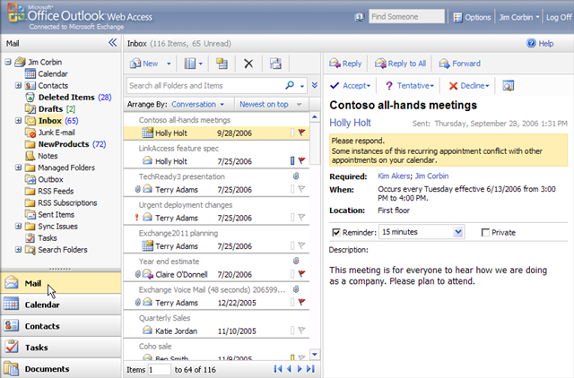
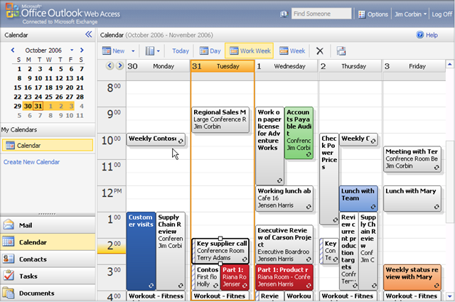
And for bonus points, Still Better Question #2: What about OWA? Consider that Microsoft already provides essentially the same thing, with the same approach, in the form of Outlook Web Access, which looks remarkably like the usual Outlook [caveat: this is an example of why I write above and below that ‘most’ Web 2.0 apps don’t try to emulate a particular OS look-and-feel; this one does]. For example (a couple of sample shots taken from this brief video overview):


The rich UI isn’t a bug, it really is a feature — a killer feature we’re going to be seeing more of, not less of, because this is what delivering software-as-a-service (SaaS) is all about. Although I use the desktop Outlook most of the time, I like OWA and think it’s the best web-based email and calendaring I’ve seen especially when I’m away from my machine (and I’ve tried several others, though granted you do need to be using Exchange). I suspect its UI conventions are probably pretty accessible even to non-Windows users, though that’s probably debatable and your mileage may vary.
Fallacy #2: “A web app that apes the conventions of a desktop application is “
The second fallacy is Jeff’s comment (boldface original):
a web app that apes the conventions of a desktop application is attempting to cross the uncanny valley of user interface design.
I think this is flawed for three reasons.
First, the “uncanny valley” part makes the assumption that people will find it jarring that the app tries to look like a desktop application. (This concern is related to, but different from, the concern of fallacy #1.) But most such apps aren’t doing that at all, because they know their users will access them from PCs, Macs, and lots of different environments, and they have to look reasonable regardless of the user’s native environment. They’re usually not trying to duplicate a given platform’s native look and feel.
Second, what they are doing is borrowing from UI components and conventions that already work well in desktop GUI environments, and are common across many of those environments. When you have no standards for Web 2.0 look and feel, then doing the best you can by borrowing from ideas we already know work pretty well isn’t just okay, it’s necessary. What else can you do?
Finally, the worst part is this: The whole point of SaaS is to deliver desktop-like rich-GUI applications on the web. So what is being labeled ‘wrong’ above is the whole point of what we’re doing as an industry.
“SaaS/Web 2.0 on Web 1.0”: The new “GUI on DOS”
Most SaaS/Web 2.0 applications today look and feel pretty much the way GUI applications looked and felt like on DOS, before technologies like Windows and OS/2 PM existed. Around the late 1980s, people wrote lots of GUI applications that ran on DOS, but we didn’t have a widely-used common GUI infrastructure that handled basic windows and menus and events, much less standards like CUA that tried to say how to use such a common infrastructure if we had it. So they each did their own thing, borrowing where possible from what seemed to work well for GUIs on other platforms.
Twenty years ago, everyone writing GUIs on DOS designed the UIs as best they could, borrowing where possible from what they saw worked on platforms like the Macintosh and Xerox Alto and Star — but the results were all over the map, and would stay that way until a standard environment, followed by standard guidelines, came into being.
Today, everyone writing rich Web 2.0 applications is doing their own thing, borrowing as best they can from Macs and Windows and others — but the results are all over the map, and will continue to be until there actually is such a thing as a UI standard for rich-GUI web applications. You can see that in the differences between Zimbra and Outlook Web Access. In the meantime, it’s not just okay to borrow from what we’ve learned on the desktop; it’s necessary.
And the question isn’t whether metaphors users already understand on the desktop will migrate to the web, but which ones and how soon, because it’s the whole point of SaaS. The industry will soon be going well beyond Google Apps; with offerings like Office Online already announced for the short term, which puts still more rich-client GUI apps like word processors and spreadsheets in the browser (with functionality somewhere between Google Apps and the desktop version of Office).
Zimbra and Outlook Web Access aren’t examples of poor web app design, but exactly the opposite: They’re just the beginning of the next wave of rich web apps.

